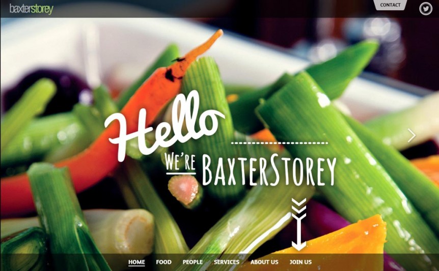
I don’t normally blog about this kind of thing, but having recently checked out the BaxterStory website twice, I was amazed at the difference. While there was nothing wrong with the old site, the thing that struck me was how much good design has changed over the past few years. It wasn’t all that long ago that the standard screen size websites were designed for was 1024px wide, or even 800px to be cautious. This meant lots of site designed a while ago now look decidedly tiny on modern large desktop monitors. Its frustrating to see more white space on your browser when its maximized, compared to the spaced in the middle taken up by the website. The outgoing BaxterStorey website was aolong these lines – I nice clean website, but on my 24″ screen, tiny.
The new BaxterStorey website designed by Rawnet, takes the modern large full screen design to its full potential… its slick, easy to read, has (ajax?) page navigation that doesn’t reload the page, full screen sliding background and generally a very high impact. While this may not be what all clients want, it is the way site design for desktops is going, and I for one love it.
I’m sure the team at BaxterStorey will be very pleased with their new site – they’ve certainly set the bar high for contract caterers that’s for sure!
Speaking of which, the BaxterStorey staff know how to do a great Victoria sponge…Mmm Hungry!
More videos from BaxterStorey